Brand Identity Guidelines
Your one-stop-shop for all things VTF branding and assets


VTF Logos
The Virtually Testing Foundation logo represents our like-minded values, and our outreach into different communities and the world as a whole. The curved and elongated upper bar of the T conveys a feeling of synergy and interconnectedness within our organization. The aqua blue color of the logo embodies a sense of loyalty, trustworthiness, and intelligence.

Logo Formats
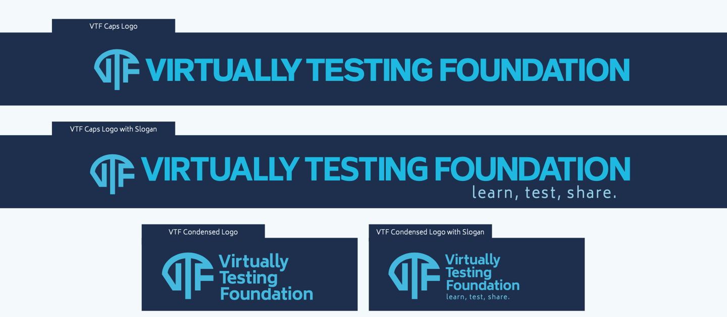
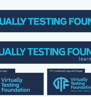
There are two main formats that the Virtually Testing Foundation logo is available in: full-length and condensed. Full-length logos should be used when there is enough horizontal space to fit the whole logo. Condensed logos should be used when horizontal space is limited.
Variants
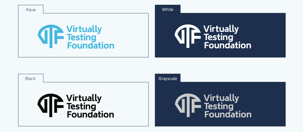
There are four color variations available for each of our logos: aqua, grayscale, white, and black. Be sure that the logo color you choose is clearly visible on its background.
Our Badges and Marks
The Virtually Testing Foundation’s badges and marks should be used sparingly. They are meant to be supplementary to our full-size and condensed logos, so be sure to use them sparingly. These are also available in full color, grayscale, white on black, and black on white.




Margins and Scale
Margins
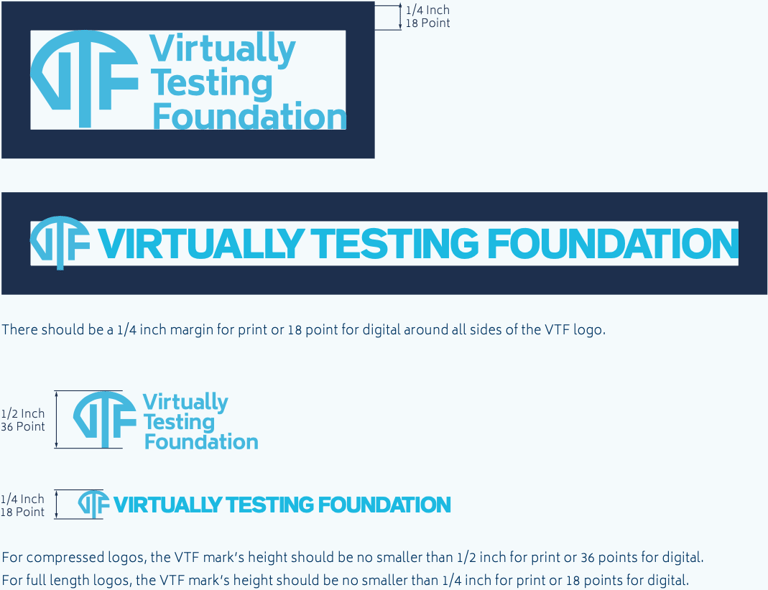
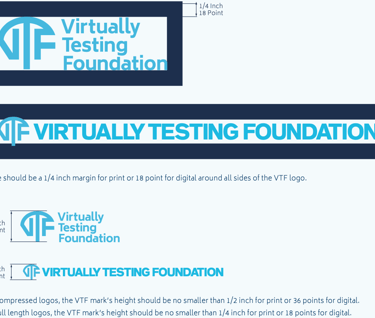
When placing any of our logos, make sure that there is enough space around it so its presense is properly conveyed. A minimum of a quarter inch for print or 18 points for digital of white space around the logo should be used to ensure legibility at any size.
Scale
When scaling any of our logos be sure to keep its clarity in mind. For condensed logos, the height of the VTF mark should be no smaller than a half inch for print or 36 points for digital. For full length logos, the height of the VTF mark should be no smaller than a quarter inch for print or 18 points for digital.
Incorrect Use
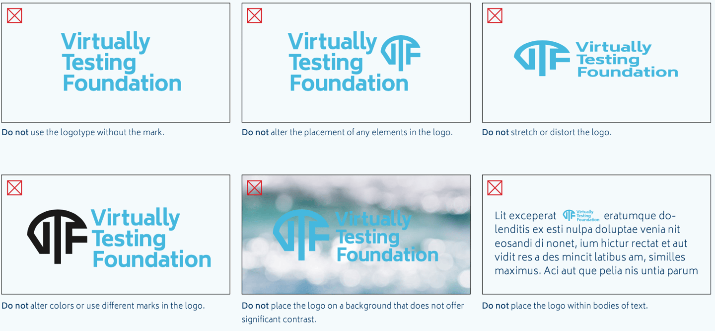
Our logo has been hand crafted to represent the attributes and values of Virtually Testing Foundation. Respect what it stands for by only using the formats that have been provided to you.
Brand Attributes


Color Pallete
The Virtually Testing Foundation color pallete consists of both a dark blue and aqua scheme. These are used in conjunction to create a visually appealing color harmony while consistently maintaining strong and legible contrast.
Pantone P 108-16 U C100 M52 Y0 K60 R0 G52 B98 #003462

Pantone P 108-15 U C83 M43 Y0 K50 R1 G73 B118 #014976
Pantone P 108-14 U C69 M36 Y0 K41 R50 G94 B137 #325e89
Pantone P 108-13 U C57 M30 Y0 K34 R79 G113 B154 #4f719a
Pantone P 108-12 U C48 M25 Y0 K29 R100 G130 B167 #6482a7
Pantone P 108-11 U C40 M21 Y0 K24 R121 G145 B180 #7991b4
Pantone P 108-10 U C31 M16 Y0 K19 R145 G164 B194 #91a4c2
Pantone P 108-9 U C22 M11 Y0 K13 R172 G187 B210 #acbbd2
Dark Blue Colorscheme

Aqua Colorscheme
Pantone P 115-8 U C100 M0 Y0 K0 R0 G174 B239
#00aeef
Pantone P 115-7 U C83 M0 Y0 K0 R0 G183 B241
#00b7f1
Pantone P 115-6 U C68 M0 Y0 K0 R0 G194 B243
#00c2f3
Pantone P 115-5 U C51 M0 Y0 K0 R106 G207 B246
#6acff6
Pantone P 115-4 U C37 M0 Y0 K0 R151 G218 B248
#97daf8
Pantone P 115-3 U C25 M0 Y0 K0 R185 G229 B251
#b9e5fb
Pantone P 115-2 U C13M0 Y0 K0 R217 G241 B253
#d9f1fd
Pantone P 115-1 U C4 M0 Y0 K0 R241 G250 B254
#f1fafe
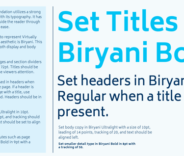
Typographic Hierarchy
Subscribe to latest announcements
Copyright © 2025 Virtually Testing. All rights reserved.
